Lecture 7-1: Communicating the Data Summary
DATA 510: Data Science Capstone
June 22, 2026
Learning Objectives
Today’s Objectives
What You Will Leave With
By the end of this lecture, you will be able to:
- Tailor one data summary to audiences at different levels of knowledge and interest, and show command of it at any level.
- Communicate the four things a summary must convey: the data, the process, integrity, and reproducibility.
- Design a data architecture diagram that answers “where did this come from” in five seconds.
- Apply write-up dos and don’ts to your M2 data summary and M4 draft.
- Present your summary at the poster session and field questions at any depth.
- Make your data pipeline knowledge stand out as the differentiator it is.
Course Connection: This supports the Visualization and Communication pillar and the Data Engineering pillar. Tonight is the bridge between your M2 data summary (this week) and your M3 poster (week 10).
Where M2 Sits
The data summary is the first time your peer POs and I see what your data actually is, not what you hoped it would be in M1. Everything downstream (poster, write-up, defense) builds on how clearly you tell this story now.
The M2 Deliverable
A quick reminder of what you are actually submitting this week.
The M2 Deliverable
What M2 Demonstrates
From the Data Summary assignment:
- The data needed to answer your research question is gathered and organized, or pipelines that gather it run without manual intervention.
- After this milestone you should not need active work to bring in new data; analysis can continue, but ingestion is stable.
- Worth 9% of your grade, submitted as a PDF that points to repo paths, scripts, and README sections.
Required Contents
Your submission must include all eight sections:
- Research question reminder linking the frozen data scope to your question.
- Data inventory (source, license, size, date range, refresh, repo location).
- Schema and organization (logical schema or ERD, keys, join paths, raw vs analysis-ready).
- Ingestion status (manual pulls done, or pipeline described with schedule and failure handling).
- Data quality and profiling (missingness, duplicates, outliers, mitigations).
- Reproducibility (commands to rebuild the analysis-ready dataset, environment notes).
- Ethics and access controls (PII handling, redaction, consent, sharing constraints).
- Freeze statement (explicit: no further ingestion work planned; document any deltas).
How It Is Graded
| Criterion | Points |
|---|---|
| Completeness vs research question | 25 |
| Organization and schema | 20 |
| Pipelines or stable ingestion | 20 |
| Quality and profiling | 15 |
| Reproducibility | 10 |
| Ethics and freeze | 10 |
Tonight is about communicating these eight sections well, in the write-up and at the poster, so they read as command and not as a checklist.
Part 1: What a Data Summary Is
The data is the project. Everything else is commentary.
What a Data Summary Is
The Job of the Summary
A data summary answers four questions for a reader who was not in the room:
- The data: what are these sources, how big, how trustworthy?
- The process: how did raw inputs become an analysis-ready dataset?
- The integrity: how do we know it is correct and complete enough?
- The reproducibility: could someone else rebuild this?
If a reader finishes your summary unable to answer those four, the summary failed, no matter how pretty the charts are.
What It Is Not
A data summary is not:
- A notebook dump with forty cells of
df.head()and no narrative. - A victory lap that re-reports your M1 plan as if it were findings.
- A tooling brochure (“we used Airflow and Postgres and XGBoost and…”).
The reader does not care that you ran code. They care what the data is, whether they can trust it, and what it took to get there.
Two Surfaces, One Story
You will tell this same story on two very different surfaces:
| Surface | Milestone | Reader behavior |
|---|---|---|
| Write-up | M2, then M4/M5 | Reads alone, can re-read, no one to ask |
| Poster | M3, poster session | Skims in 10 seconds, you are standing there |
The content is the same four things. The packaging is completely different. Most of tonight is about packaging.
🧠 Quick Quiz: The Core Four
Which of these is not one of the four things a data summary must convey?
A. The data (sources, volume, trust)
B. The process (raw to analysis-ready)
C. The integrity (validation, completeness)
D. The marketing (why your topic is trendy)
D. Trendiness is not integrity. A reader needs data, process, integrity, and reproducibility. “This topic matters” belongs in your introduction, not your data summary.
Part 2: Know Your Audience
Know Your Audience
The Layered-Audience Problem
At the poster session, in one hour, the people who stop at your poster include:
- A funder or executive who wants the one-sentence “so what.”
- A domain expert who knows the field better than you do.
- A fellow data scientist (or hiring manager) who wants rigor.
- A curious novice who has never heard of your topic.
You cannot write four posters. You write one that lets each of them enter at their level.
Progressive Disclosure
Structure every artifact like an inverted pyramid: the widest, simplest layer reaches everyone, and each layer down adds detail for a smaller, more technical audience.
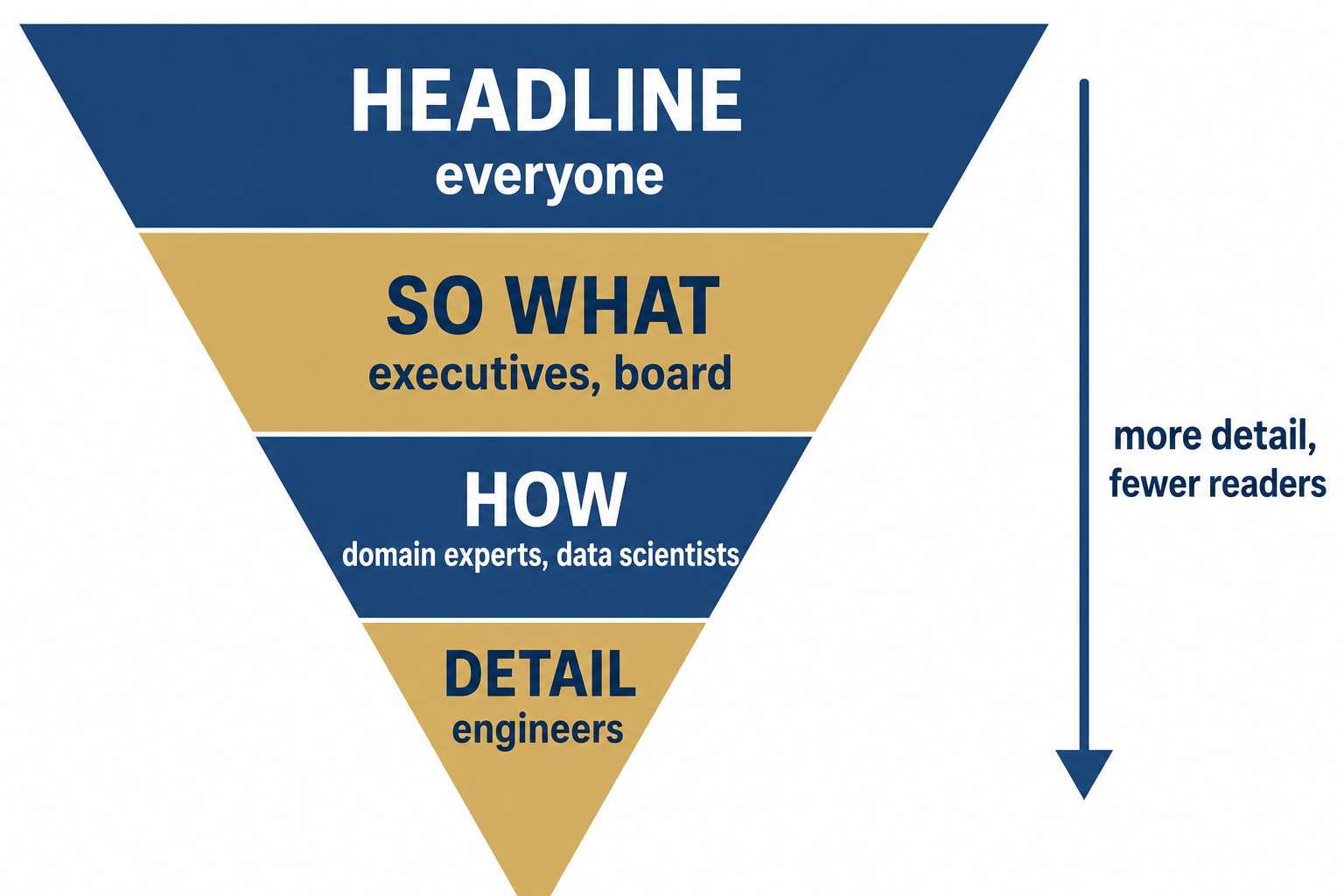
The funder reads the top. The data scientist reads to the bottom. Nobody is forced to read more (or less) than they want.
Show Command At Any Level
“Command” means you can zoom in and out on demand:
- Asked the one-liner? Give it in a sentence, no hedging.
- Asked about the join key? Name the column, the cardinality, the dedup rule.
- Asked about a limitation? State it plainly before they have to dig.
The tell of someone who does not have command: they answer every question at the same altitude. Either drowning a board member in GROUP BY details, or hand-waving a fellow engineer with “it just works.”
The One-Sentence Test
Before you write anything, finish this sentence:
“We integrated [these sources] into [this dataset] so that [this stakeholder] can [make this decision].”
If you cannot say it cleanly, your reader cannot either. This sentence becomes your poster headline and your abstract’s first line.
🧠 Quick Quiz: Reading the Room
A nonprofit board member at your poster asks, “So can you predict who comes back?” The best first response is:
A. A walkthrough of your random forest hyperparameters
B. "Roughly. We can flag higher-likelihood cases; here's the catch." then offer detail
C. "It depends on the confusion matrix and class imbalance"
D. "Let me show you the code"
B. Lead with the honest one-liner at their altitude, signal the caveat, and let them pull you deeper. That is command.
Part 3: The Four Pillars in Practice
The Four Pillars
Pillar 1: The Data
Give a source inventory, not prose. For each source:
- What it is and who publishes it.
- Volume (rows, files, size) and time coverage.
- Refresh cadence and approval/access status.
| Source | Volume | Coverage | Access |
|---|---|---|---|
| Intake system export | ~300 clients/yr | 2024-2025 | Approved, one-time pull |
| Case management export | ~300 clients/yr | 2024-2025 | Approved |
| Web application form | ~8,000 records | 2024-2025 | Approved |
A table like this tells a reader more in ten seconds than three paragraphs.
Pillar 2: The Process
Show the path from raw to analysis-ready as stages, not a wall of script names:
Name the transforms on the edges. That is where the engineering judgment lives.
Pillar 3: The Integrity
Integrity is numbers, not adjectives. “Clean data” means nothing. Show your validation:
| Check | Result |
|---|---|
| Duplicate records | 0 |
| Missing predictor values | 0 |
| Unmatched rows after join | 4.1% (held out, documented) |
| Date range validated | 1956-04 to 2026-01 |
A validation table is the single most credibility-building element in a data summary. It says “I looked,” not “trust me.”
Pillar 4: The Reproducibility
Reproducibility is the difference between a result and a reusable asset. Show:
- Raw / interim / processed separation (raw stays immutable).
- A data dictionary and a lineage note for every derived field.
- The command and working directory to rebuild the processed data.
The test: could a new analyst clone the repo and regenerate processed/ without texting you? If not, document until they can.
Mapping Pillars to Sections and Panels
The four pillars map directly onto both surfaces:
| Pillar | Write-up section | Poster panel |
|---|---|---|
| Data | Data sources | Source inventory box |
| Process | Data engineering | Architecture diagram |
| Integrity | Data quality | “By the numbers” callout |
| Reproducibility | Reproducibility | Repo link + lineage note |
You are not inventing structure. You are filling a known frame.
Part 4: Data Architecture Diagrams
A good diagram answers “where did this come from” before the reader finishes asking.
Architecture Diagrams
Why Diagrams Earn Their Space
On a poster, the architecture diagram is usually the most-read element after the title. It lets a reader reconstruct your whole pipeline at a glance and it signals, instantly, that you understand your own system.
A paragraph describing a pipeline is forgettable. A clean left-to-right diagram is the thing people photograph.
Dos
- Flow left-to-right or top-down, sources to outputs.
- Label the edges with the transform (join, de-id, aggregate), not just arrows.
- Group raw / interim / processed visually.
- Show the outputs and the stakeholder at the end of the flow.
- Keep it under about ten nodes. A poster diagram is not a UML class diagram.
Don’ts
- Do not draw every script and file. That is a dependency graph, not a story.
- Do not leave arrows unlabeled. Unlabeled arrows hide your actual work.
- Do not mix five shapes with no key. Consistency reads as competence.
- Do not bury the output. The reader wants to see where the data lands.
Example 1: Nonprofit Multi-System Integration
A private-data project where automation is not possible, so the manual, documented process is the contribution:
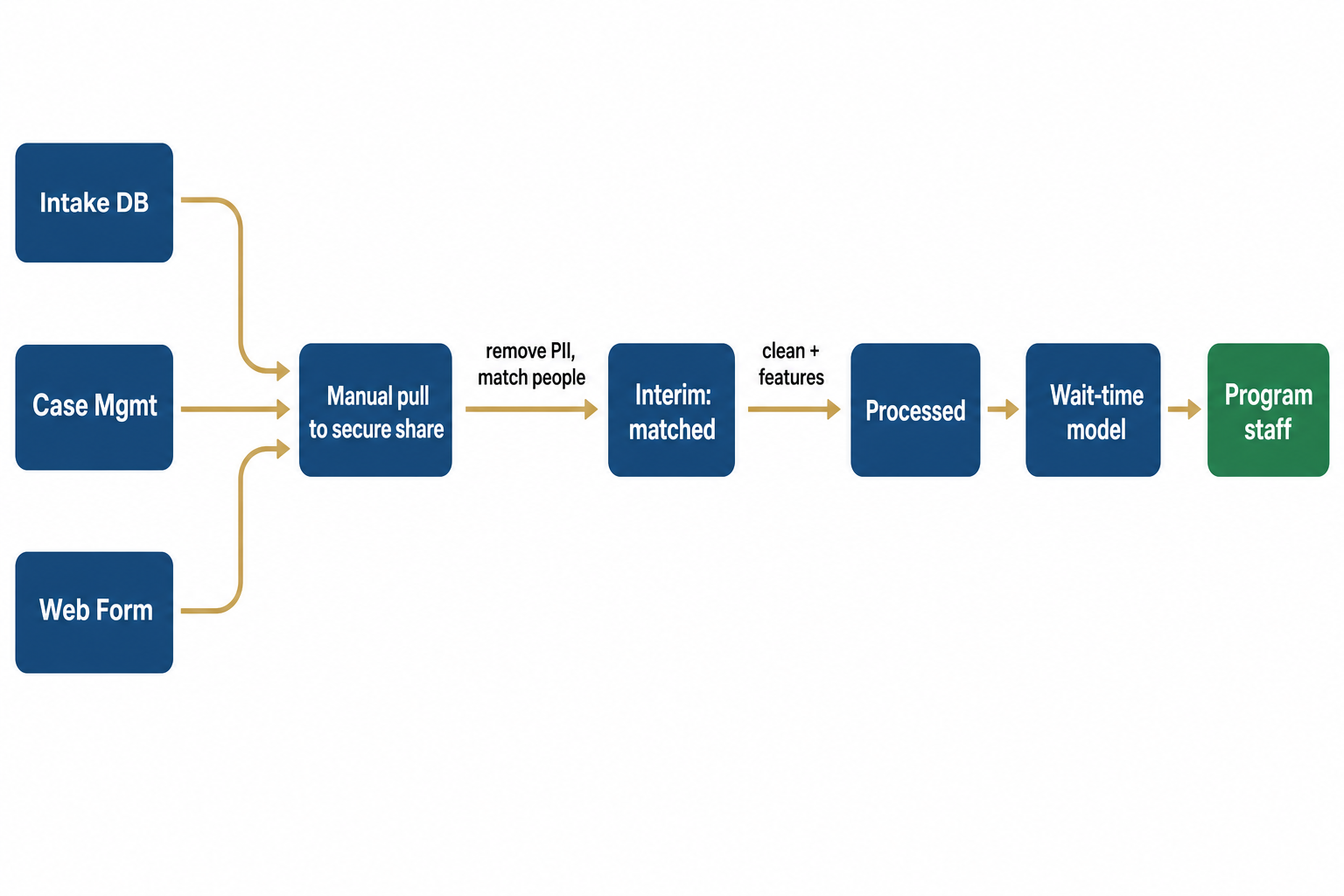
Notice the PII removal and person-matching are on the edges. That is the hard part, so it gets labeled. The flow ends at the stakeholder, not at the model.
Example 2: Multi-Stream Financial ETL
A near-real-time pipeline where the engineering is the headline:
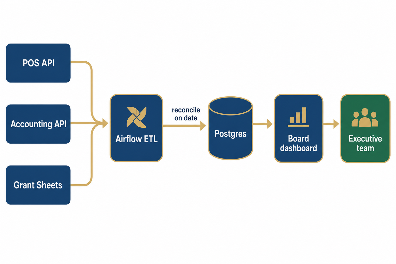
The reconciliation step (the join across systems on a common date) is the engineering risk, so it is the labeled edge.
Example 3: Multi-Source Public-Data Panel
A forecasting project that integrates many public series into one analytical panel:
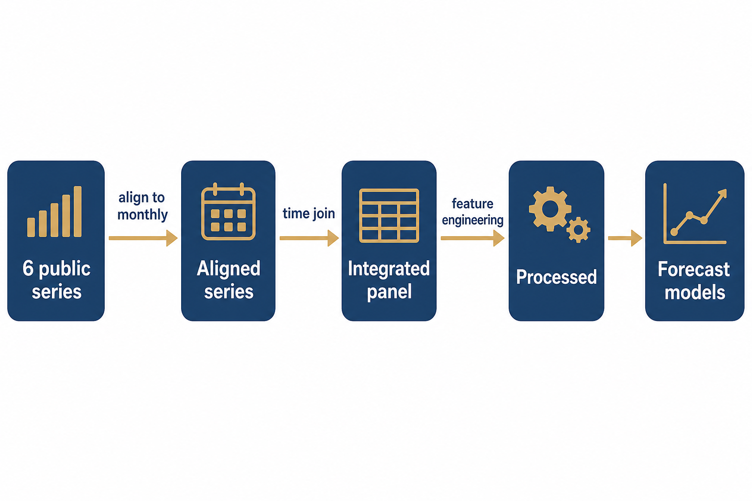
Frequency alignment is the silent killer in multi-source time data, so it is the first labeled edge.
Bad vs Good
Bad
File names, no transforms, no stakeholder. Reader learns nothing.
Good
Stages, transforms, and the decision it feeds.
Tools
- Mermaid: text-based, version-controllable, renders in Quarto. Great for write-ups and these slides.
- draw.io / diagrams.net: free, drag-and-drop, exports clean PNG/SVG for posters.
- Excalidraw: fast, hand-drawn feel, good for a sketch you refine later.
Whatever you use, export a high-resolution PNG or SVG for the poster. A blurry diagram undoes all the clarity.
🧠 Quick Quiz: Diagram Smell Test
Your architecture diagram has 22 boxes, every box is a Python file, and the arrows are unlabeled. The problem is:
A. Too few boxes
B. It is a dependency graph, not a data story; collapse to stages and label transforms
C. It needs more colors
D. Nothing, detail is always better
B. Collapse files into raw/interim/processed stages, label the transforms on the edges, and end at the stakeholder. Aim for under ten nodes.
Part 5: The Write-Up
The Write-Up
Lead With Question and Data
Open the data section with what the data is and why it answers your question, not with your tech stack.
- Don’t: “We deployed Postgres on Railway with Airflow orchestration…”
- Do: “We integrate three service systems covering ~8,000 applications so we can model shelter wait time. Here is what each source contributes.”
Tooling is a detail of the process pillar, not the headline.
Use Tables, Not Walls of Prose
Two tables do the heavy lifting in any data summary:
- Source inventory (Part 3, Pillar 1): one row per source.
- Validation results (Part 3, Pillar 3): one row per check.
A reader scanning your write-up should be able to read just those two tables and trust your data.
Be Honest: “Changes Since M1”
If your data shifted since the proposal (a source fell through, a join did not work, scope narrowed), say so in a short Changes since M1 note.
Honesty reads as maturity. A silent rewrite that contradicts your proposal reads as either careless or evasive. Reviewers always notice.
Cross-Reference, Do Not Paste
- Give every figure and table a label and a caption.
- Refer to them in prose (“as shown in the architecture diagram”) using cross-references.
- Never paste raw console output as your evidence.
A write-up reads like a report. A folder of screenshots named chart_final3.png reads like a panic.
Write-Up Don’ts (From the Wild)
These are real anti-patterns that cost credibility:
- Undefined jargon: “directional corporate momentum” means nothing to a board. Define terms or drop them.
- Impossible claims: “zero orphan transactions” across POS and accounting joins is not achievable; state a realistic threshold and how you handle the remainder.
- Arbitrary thresholds: “90% accuracy” with no baseline is a guess. Compare to a sensible baseline instead.
Write-Up Dos
- Define every domain term on first use (your novice reader and your future self both need it).
- State a baseline before any performance number.
- Set realistic success criteria (“under 5% unmatched, documented” beats “zero”).
- Name your limitations before a reviewer finds them.
🧠 Quick Quiz: Spot the Weak Claim
Which sentence belongs in a strong data summary?
A. "Our pipeline achieves zero orphan transactions."
B. "The model is 90% accurate."
C. "4.1% of POS rows did not match an accounting entry; we hold these out and flag them for manual review."
D. "We used cutting-edge tools."
C. It gives a real number, an honest gap, and a handling plan. A, B, and D are unverifiable or unrealistic.
Part 6: The Poster Session
The Poster Session
A Poster Is Not a Paper on a Wall
The poster’s job is to start a conversation, not to be read end-to-end. Design for a reader who gives you ten seconds before deciding to stop.
- One dominant takeaway in large type.
- The architecture diagram as a visual anchor.
- A “by the numbers” callout (volume + key validation figures).
- Minimal text; you are the narration.
The Three Versions of Your Talk
Have these rehearsed and ready to deploy based on who stopped:
| Version | Length | For whom |
|---|---|---|
| The hook | ~30 seconds | Anyone walking by |
| The walkthrough | ~2 minutes | Genuinely interested |
| The deep dive | ~10 minutes | Expert or evaluator |
The hook is the one-sentence test from Part 2. Each longer version adds a layer of the pyramid.
Fielding Questions At Any Level
- Match their altitude first, then offer to go deeper.
- If you do not know, say “I do not know, here is how I would find out.” That is command, not weakness.
- Redirect overly broad questions to your scope: “Great question; that is outside what this data can support, but here is what it can say.”
Poster Don’ts
- Do not read your poster to the visitor. They can read.
- Do not overclaim. One honest finding beats three inflated ones.
- Do not get defensive about limitations. You raising them first is a strength.
- Do not bury the takeaway under method. Lead with the “so what.”
🧠 Quick Quiz: The Ten-Second Test
A visitor glances at your poster for ten seconds and walks on. The most likely design failure is:
A. Not enough equations
B. No single dominant takeaway; the eye had nowhere to land
C. The font was too large
D. Too few authors listed
B. If there is no clear visual hierarchy and headline takeaway, a skimming reader finds no reason to stop. Lead the eye to one big idea.
Part 7: Make Your Pipeline Shine
Make Your Pipeline Shine
The Pipeline Is Your Differentiator
Many projects have a model. The thing that separates a capstone is whether the data engineering story is told well. That is where your judgment shows.
Anyone can call .fit(). Far fewer can explain how three messy systems became one trustworthy dataset.
Tell the Engineering Story
When you present, surface the moments that show command:
- The hard join: “Matching people across systems with no shared ID; here is the rule we used and its failure rate.”
- The validation catch: “EDA flagged duplicate dates; we traced it to a frequency mismatch and fixed it here.”
- The lineage: “Every derived field traces back to a raw source through this documented step.”
These are the stories that make a reader trust everything else.
The “New Analyst” Test
Frame your reproducibility around a concrete person:
“Could a new analyst clone this repo and rebuild
processed/without asking me a single question?”
If yes, say so and show the one command. If no, that is your next PBI. This framing is more persuasive than the word “reproducible.”
What Stands Out vs What Blends In
| Blends in | Stands out |
|---|---|
| “We cleaned the data.” | “We dropped 312 duplicate dates from a frequency mismatch.” |
| “We used several sources.” | A labeled architecture diagram ending at the stakeholder. |
| “The data is reliable.” | A validation table with real counts. |
| “It is reproducible.” | “Clone, run make data, get the identical panel.” |
Specificity is command. Vagueness is forgettable.
Wrap-Up
Wrap-Up
The Big Ideas
- A data summary conveys four things: the data, the process, the integrity, the reproducibility. Everything else is decoration.
- One artifact, layered for many readers. Progressive disclosure lets a funder and an engineer both leave satisfied.
- Command means zooming in and out on demand, matching the question’s altitude.
- A good architecture diagram is your most valuable real estate. Stages, labeled transforms, ends at the stakeholder.
- Specificity builds trust. Real numbers and honest gaps beat adjectives and inflated claims.
- Your pipeline is the differentiator. Tell the engineering story out loud.
Your M2 Checklist
In-Class Activity Next
We will now do a paired activity using realistic project scenarios.
- Handout: Scenario Cards and Persona Bank
Pair with your neighbor and get ready to count off.
References
References
- Cordova, L. P. DATA 510 Write-Up Rough Draft. https://courses.lpcordova.phd/data510/project/write-up-rough-draft.html
- Cordova, L. P. DATA 510 Technical Writing with Quarto (Lecture 5-1). https://courses.lpcordova.phd/data510/lectures/05-1-techwriting-quarto/
- Knaflic, C. N. (2015). Storytelling with Data: A Data Visualization Guide for Business Professionals. Wiley.
- Tufte, E. R. (2001). The Visual Display of Quantitative Information (2nd ed.). Graphics Press.
- Wickham, H., & Grolemund, G. (2017). R for Data Science (Communicate section). https://r4ds.had.co.nz/
- Mermaid Project. (2024). Mermaid Diagram Syntax. https://mermaid.js.org/